Re-implementing Player Roles Clustering in Python
With so much public work happening in the football analytics sphere in the last year, there have been tons of new and interesting ideas popping up. With that, there have also been a lot of newcomers into the field. One of the most popular questions is “How to get started with football analytics?”. While there are lots of tutorials and guides, I personally feel like there’s a lot of educational value in simply re-implementing others’ ideas. That is, you see a model/methodology in another language or framework and you try to flesh it out in code in your preferred language. Aside from how it is a learning experience for you yourself, you’re also contributing to the open-source football analytics community. Having multiple methods to do the same thing definitely helps to expand the original idea’s reach.
To that end, I have decided to implement this excellent blog from Michael Imburgio - “Defining Roles: How Every Player Contributes to Goals”. In the article, Michael tries to move past the on-paper formations for players and instead, cluster them based on the roles they’re performing on the pitch. Personally, this is one of the best written pieces on clustering players. If you haven’t read it already, you should because a) it’s really cool, and b) I’ll be referencing it heavily henceforth.
Michael has also made the original R code and the MLS data(!) available here. We’ll try to work this out in Python instead of R and I’ve also changed the dataset; instead of the MLS, we’ll use the Premier League 2019/20 dataset (mostly because I am more familiar with the PL than the MLS).
My objective for this post is pretty simple: to try and stay as close to the original idea as possible and hopefully being able to replicate their results.
(If you’re just interested in just the code for this post, the github link’s here)
Prerequisites
I’m assuming you already have python and R installed (yeah I know I said python only but we’ll need R for a teeny tiny part). In addition, we will need these python libraries:
- Matplotlib - Plotting
- Pandas - Preprocessing and data manipulation
- Numpy - Array manipulation
- Rpy2 - Interacting with R inside Python
- Sklearn - Hierarchical clustering, dimension reduction
Optional stuff:
- Factor-analyzer - Analyzing the factor importances for our model
- Advanced-pca - Performing PCA decomposition with rotation
- Scipy - Visualizing the dendrogram
For R, you’ll just need one external library - psych.
Dataset
Michael’s original MLS data is here. It has 19 features for each player and there are a total of 275 players. Most of those (16), we can pull directly from the public sites (fbref and understat). The other three - where we differ slightly - are:
- xP% - expected Pass %
- % of possession chains in which player participated with a shot
- % of possession chains in which player participated with a key pass
Since those three features are not available publicly on fbref, I had to work those out myself. While the latter two are straightforward enough, for the xP% value, I used a simple logistic regression classifier and trained it on the spatial coordinates of passes plus some other features encoding the game state(time, score, speed of play). It’s probably not as great as ASA’s model but it will do for now.
The resulting dataframe after merging the various data sources is here and this is our starting point.
Preprocessing
Most of our preprocessing steps are outlined in the original post. We need to ‘per 90’-ify our count stats, set a minimum minutes played threshold, and then scale all count stats(the rate stats are already scaled) to the (0,1) range. The re-scaling part is important since we plan to run t-SNE next on the data.
import pandas as pd
import numpy as np
from sklearn.cluster import AgglomerativeClustering
from sklearn.preprocessing import MinMaxScaler

np.random.seed(42)
scaler = MinMaxScaler()

df = pd.read_csv("../data/data.csv")

df = df[["Player", "Pos", "90s", "Standard_Sh", "Expected_npxG", "KP", "xA", "xGChain", "xGBuildup",
         "Total_Cmp%", "Pass Types_Crs", "Dribbles_Succ", "Miscon", "Receiving_Targ",
         "Total_PrgDist", "CrsPA", "Prog", "Total_Cmp", "Short_Cmp", "Medium_Cmp", "Long_Cmp",
          "xPassing%", "shot_chain%", "key_pass_chain%"]]

df.columns = ['player_name', 'position', '90s', 'shots_n', 'npxG', 'key_passes_n', 'xA', 'xG_chain', 'xG_buildup',
              'pass_cmp_rate', 'crosses_n', 'succ_dribbles_n', 'miscontrols_n', 'receiving_target_n',
              'progressive_distance', 'crosses_pen_area_n', 'progressive_passes_n', 'succ_passes_n',
              'succ_short_passes_n', 'succ_medium_passes_n', 'succ_long_passes_n', 'x_pass_cmp_rate',
              'shot_chain_rate', 'kp_chain_rate']


df.fillna(0, inplace=True)
#df["succ_short_passes_n"] = df['succ_short_passes_n'] + df['succ_medium_passes_n']

df["short_ratio"] = df["succ_short_passes_n"]/df["succ_passes_n"]
df["long_ratio"] = df["succ_long_passes_n"]/df["succ_passes_n"]

df = df[(df["90s"]>13) & (df["position"]!="GK")].reset_index(drop=True) ##only outfield players with 1100 minutes

##per 90ify everything all counting metrics
df[['shots_n', 'npxG', 'key_passes_n', 'xA', 'xG_chain', 'xG_buildup', 'crosses_n', 'succ_dribbles_n', 'miscontrols_n',
    'receiving_target_n', 'progressive_distance', 'crosses_pen_area_n', 'progressive_passes_n']] = df[['shots_n', 'npxG', 'key_passes_n', 'xA', 'xG_chain', 'xG_buildup', 'crosses_n', 'succ_dribbles_n', 'miscontrols_n',
    'receiving_target_n', 'progressive_distance', 'crosses_pen_area_n', 'progressive_passes_n']].div(df['90s'], axis=0)

##drop useless columns
df.drop(["succ_passes_n", "succ_short_passes_n", "succ_long_passes_n", "succ_medium_passes_n"], axis=1, inplace=True)

features = ['shots_n', 'npxG', 'key_passes_n', 'xA', 'xG_chain', 'xG_buildup', 'crosses_n',
            'succ_dribbles_n', 'miscontrols_n', 'receiving_target_n', 'progressive_distance',
            'crosses_pen_area_n', 'progressive_passes_n', 'short_ratio', 'long_ratio',
            'pass_cmp_rate', 'x_pass_cmp_rate', 'shot_chain_rate', 'kp_chain_rate']


df[features] = pd.DataFrame(scaler.fit_transform(df[features].values), columns=features, index=df.index) ##scale values inplace
X = df[features].values

N_FEATURES = len(features)
N_CLUSTERS = 11
N_DIMENSIONS_TSNE = 2
N_INTERPRETABLE_DIMS = 8

print(f"Number of features: {N_FEATURES}")
Number of features: 19
Dimension Reduction and Clustering
The article isn’t 100% clear on this but the first step we need to perform before clustering the data is to reduce the dimensions - from 19 to 2. We’ll use t-SNE to do this. The original article points to this guide from the dynamic duo of Eliot and Cheuk to learn more about t-SNE and its applications in football stuff and I really couldn’t do better than that.
from sklearn.manifold import TSNE

Xs_embedded = TSNE(n_components=N_DIMENSIONS_TSNE).fit_transform(X)
import matplotlib.pyplot as plt

with plt.style.context('ggplot'):

    fig, ax = plt.subplots(figsize=(12,8))
    colors = df['position'].map({'DF': 'red',
                             'MFDF': 'green',
                             'MF': 'purple',
                             'MFFW': 'pink',
                             'FW': 'blue',
                             'FWMF': 'violet',
                             'DFMF': 'orange',
                             'DFFW': 'gold'})

    ax.scatter(x=Xs_embedded[:, 0], y=Xs_embedded[:, 1], c=colors)
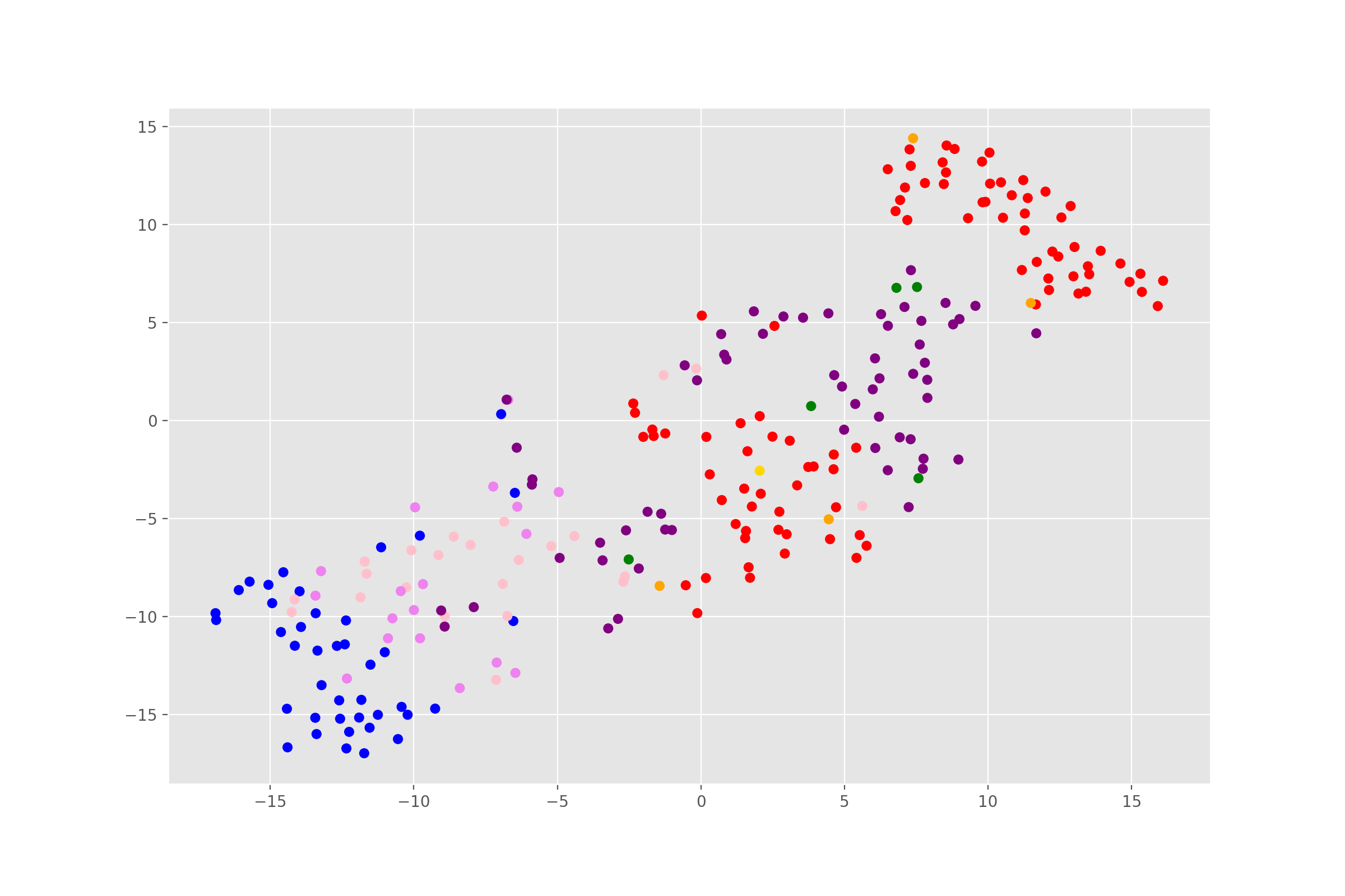
As we can see, the clusters are looking pretty, well, cluster-y. That’s a good sign. The two separate groups of defenders (in red) are probably, fullbacks and center backs (it’s a shame fbref doesn’t differentiate between the two). Feel free to plot the names of the players to check what the other clusters roughly are.
For clustering our t-SNE reduced player attributes, we’ll use a hierarchical clustering method. In the original, Michael settles on 11 clusters. That gives us enough scope for at least two player roles for each position on paper - forwards, creative mids/wide forwards, deeper midfielders, center backs, and fullbacks(theoretically, at least). It is also a nice number to form a playing 11 at the end consisting of players from the different clusters with the objective being to create a balanced team across the board.
import scipy.cluster.hierarchy as shc

with plt.style.context('ggplot'):
    fig, ax = plt.subplots(figsize=(12, 8))
    ax.title.set(text="Player Hierarchical Clustering")
    dend = shc.dendrogram(shc.linkage(Xs_embedded, method='ward'))
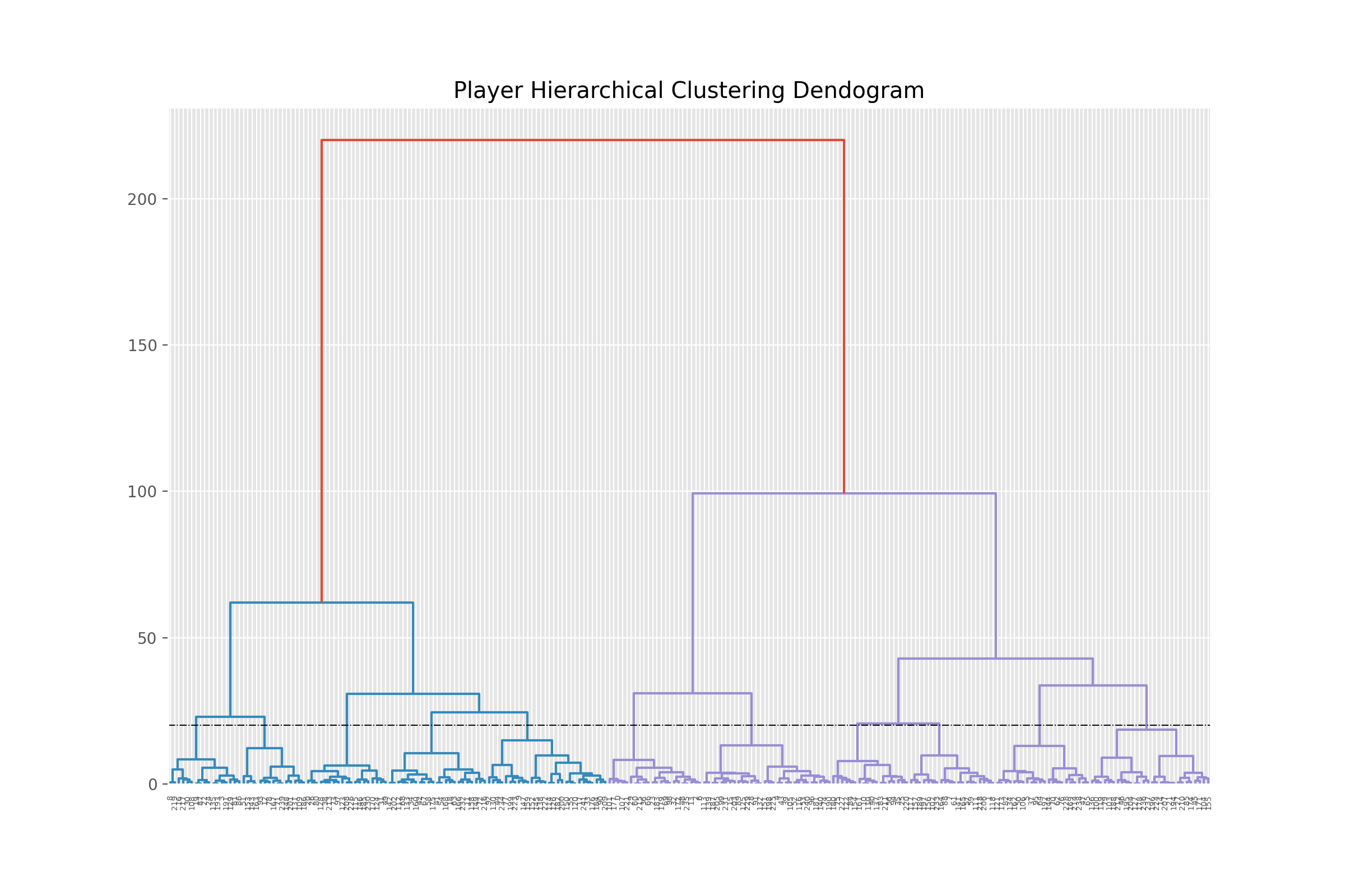 11 clusters means a cut-off right around the vertical dotted line.
### Clustering and generating labels
model = AgglomerativeClustering(distance_threshold=None, n_clusters=N_CLUSTERS)
labels = model.fit_predict(Xs_embedded)
df['label'] = labels
After running the clustering algorithm and saving the labels, we’ll try to re-plot the same scatter from before but this time using the generated labels from our agglomerative function. If we’re seeing clearer clusters of players, then we’re definitely on the right track.
with plt.style.context('ggplot'):

    fig, ax = plt.subplots(figsize=(12,8))
    ax.scatter(x=Xs_embedded[:, 0], y=Xs_embedded[:, 1], c=labels, cmap='gist_ncar')
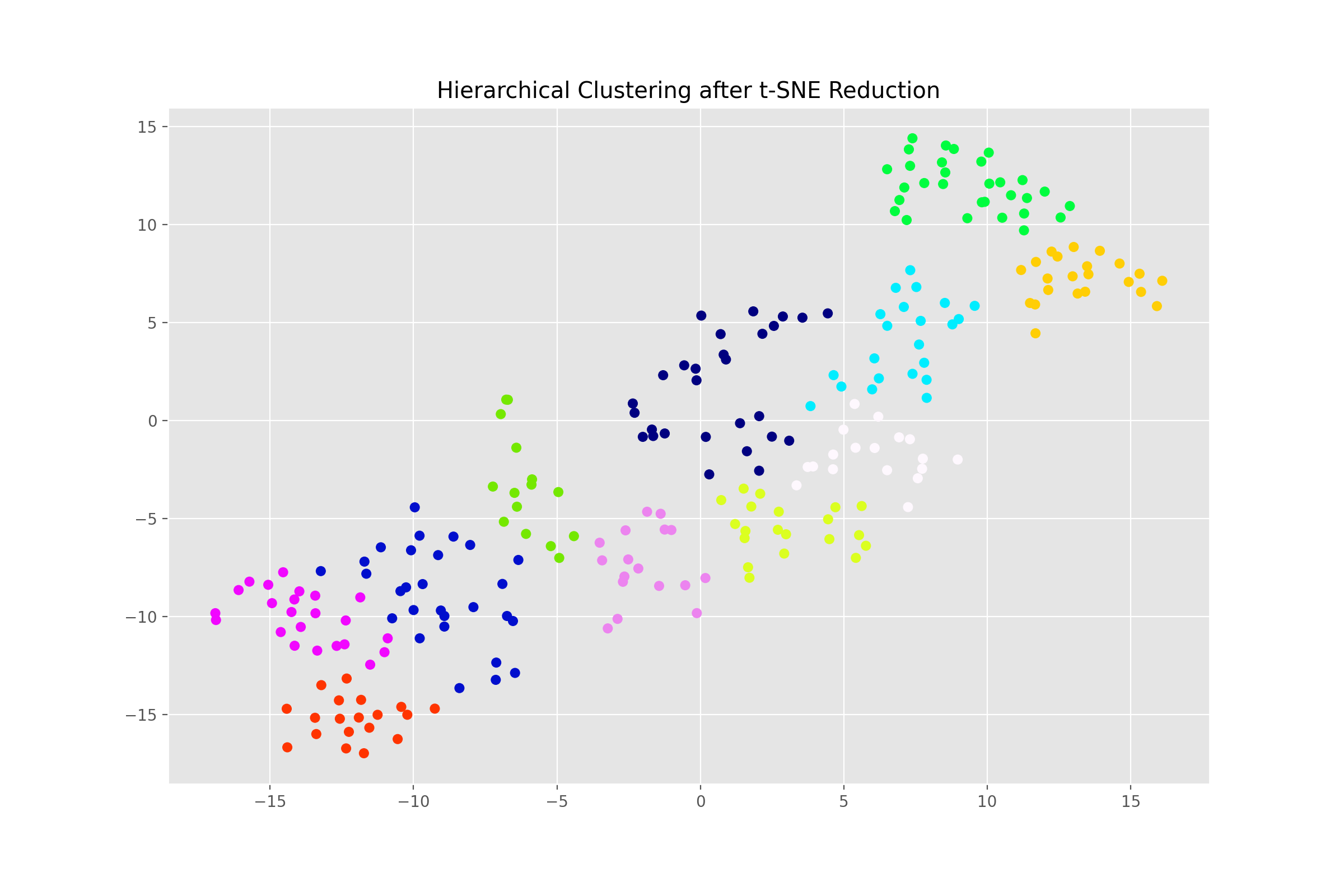
Success! The final step is to explore the clusters and define our roles.
Interpreting the Clusters
What did not work
“…The simplest, and most thorough, way to interpret these clusters is to examine the distribution of each original statistic within the cluster….
…To help, we can go back to a dimension reduction method I skimmed over earlier: PCA. PCA reductions give us more interpretable dimensions…
…A standard PCA yields dimensions that are not correlated with each other, but in our case we expect that many dimensions are correlated with each other - for example, dimensions that define a backfield player are probably inversely correlated with dimensions that define a striker. By applying a promax rotation to the dimensions, we end up with clusters that are allowed to be correlated with each other and yield 8 dimensions that we’ll use to interpret the clusters…”
All that sounds fairly easy but this step was actually deceptively tricky. For one, there’s no helper module in python for performing a PCA with promax rotation. And I’m not even remotely good enough at linear algebra to try and perform the rotation by hand using numpy or something.
I tried two ways to work around that. The first one was to try a Factor Analysis with promax rotation instead of PCA with promax.
from factor_analyzer import FactorAnalyzer
fa = FactorAnalyzer(rotation='promax', n_factors = N_INTERPRETABLE_DIMS)

fa.fit(X)

fa_Xs = fa.fit_transform(X)
The second one was to try a PCA decomp but with varimax rotation.
from advanced_pca import CustomPCA
vpca_Xs = CustomPCA(n_components=8, rotation='varimax').fit_transform(X)
Both failed for pretty much the same reason. While the loadings and the dimensions they yielded didn’t look entirely unreasonable, they actually were meaningless(or at least they weren’t producing the dimensions that we care about). For example, check out the loadings from the promax CFA below.
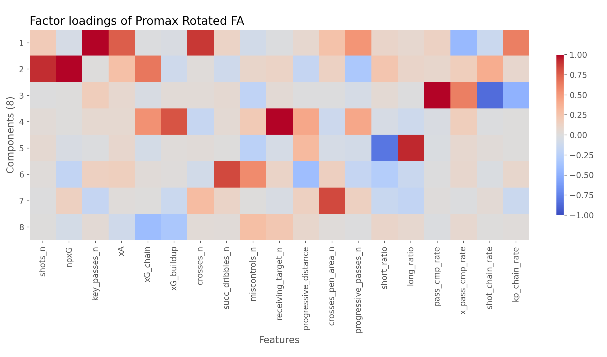
If you don’t know what you’re staring at, look at each row and see which features are hottest and coldest for them. For example, the first row is hottest at key_passes_n, xA, crosses_n, and kp_chain_rate. We can assume this dimension is probably related to Creating. Similarly the next one works out to be Shooting (high in shots_n, npxG, shot_chain_rate). And so on. The goal is to get the eight dimensions from Michael’s post.
Now since neither of the methods are really the same as Michael’s, we are almost certainly not going to get the exact eight dimensions as he did. That, however, was not even the biggest problem. When we plot the radars - comparing every cluster to the league average, we soon realize the numbers don’t really mean what we want expect to mean. For instance, check out cluster number 4.
print(df.query("label==4")['player_name'].head(5))
Jack Grealish, Kevin De Bruyne, James Maddison, Willian, Emi Buendía
These players look like they’re from the “creative midfielders/playmakers” cluster. We can safely assume they’re probably higher at creating chances than the average league player. However the results of the varimax PCA are telling a different story.
vxs = fa_Xs
vxs = scaler.fit_transform(vxs)
vxs.shape

vcols = ['Creating', 'Shooting', 'Ball retention', 'Build-up', 'Verticality',  'Dribbling', 'Crossing', 'Involvement'] ##subjective dims

results = pd.DataFrame(vxs, columns = vcols)
results['label'] = df['label']

def custom_radar(label, color, ax=None, average=True):
    with plt.style.context('ggplot'):
        ##cleaning and creating radar layout
        if ax is None:
            fig, ax = plt.subplots(subplot_kw={'projection':'polar'}, figsize=(8,8))
        else:
            fig, ax = ax.get_figure(), ax

        thetas = list(np.linspace(0, 2*np.pi, 8, endpoint=False))
        for i in thetas:
            for j in np.linspace(0,1,6, endpoint=True):
                ax.plot([i, i+np.pi/4], [j, j], linestyle='-', color='silver', alpha=.9, lw=1.1, zorder=2)
        ax.grid(b=False, axis='y')
        ax.grid(axis='x', color='silver')
        ax.set_fc('white')
        ax.set(ylim=(0, 1), yticklabels='')

        ax.set_xticks(thetas)
        ax.set_xticklabels(vcols)
        ax.spines['polar'].set_visible(False)
        ax.title.set(text='Cluster Radars')

        ##plotting
        pdf = results.query("label==@label")
        heights = pdf[vcols].mean()
        ax.fill(thetas, heights, color=color, alpha=.2, zorder=10)
        ax.plot(thetas+[thetas[0]], list(heights)+[heights[0]], color=color, label= f"Cluster {label} average", zorder=10, linewidth=3) ##

        if average:
            league_average_heights = results[vcols].mean()
            ax.fill(thetas, league_average_heights, color='k', ec='k', alpha=.15, zorder=5)
            ax.plot(thetas+[thetas[0]], list(league_average_heights)+[league_average_heights[0]], color='k', label="League average",
                    zorder=5, linewidth=2, linestyle='-.')

        ax.legend(bbox_to_anchor=(0.85, 0.95))
    return ax
ax = custom_radar(label=i, color='red')
Wait, it’s telling us that creators are shooting more and actually creating less than the average PL player. You can try this out with the other clusters too; the numbers don’t hold up any better.
What did work
In the end, I had to compromise a little and go back to R for performing the decomposition and getting our desired dimensions. Using rpy2, I called the necessary R functions from within my python session. The following code section does all of that and gives us the results dataframe.
import rpy2.robjects as ro
import rpy2.robjects.numpy2ri
from rpy2.robjects.packages import importr

rpy2.robjects.numpy2ri.activate()

nr,nc = X.shape
Xr = ro.r.matrix(X, nrow=nr, ncol=nc)

ro.r.assign("Xr", Xr) ##Xr is now a float matrix object
psych = importr('psych')

fit = psych.principal(Xr, nfactors=8, rotate='promax')

objects_dict = dict(zip(fit.names, list(fit))) ##this dictionary contains all the scores and fit evaluation data
loadings = np.array(objects_dict['loadings'])
##plt.imshow(loadings) ##if you want to check the loadings

array = np.array(objects_dict['scores'])

itp_dims = ['Shooting', 'Creating', 'Build-up', 'Ball retention', 'Verticality', 'Dribbling', 'Crossing', 'Involvement'] ##subjective interpretable metrics - the order is important

results = pd.DataFrame()
results[['player_name', 'label']] = df[['player_name', 'label']]

results[itp_dims] = array
results[itp_dims] = pd.DataFrame(scaler.fit_transform(results[itp_dims].values), columns=itp_dims, index=results.index) ##scale values to 0,1
Defining Roles
After we get our interpretable dimensions, we can finally compare players along those dimensions and investigate the inter-cluster differences more minutely. This ultimately helps us assign roles to those labels that we can understand and communicate. The original has 11 different roles for the 11 clusters (ordered from front to back):
- Pure Scorer
- Hybrid Scorer
- Playmaker
- Wide Attacker
- Support Attacker
- Pivot
- Recycler
- Crossing Specialist
- Wide Support
- Ball-playing Defender
- Backfield Outlet
To get which label corresponds to which role, I simply plotted the radars a bunch of times - comparing players from the same on-field position. Here are the results of that stored in the roles_dict dictionary.
roles_dict = { 0: 'Recycler',
               1: 'Wide Attacker',
               2: 'Pivot',
               3: 'Backfield Outlet'
               4: 'Playmaker',
               5: 'Crossing Specialist',
               6: 'Ball-Playing Def.',
               7: 'Pure Scorer',
               8: 'Hybrid Scorer',
               9: 'Support Attacker',
               10:'Wide Support'
              }
We can call our (slightly tweaked) custom_radar function defined above to create those comparison radars. For example, comparing ball-playing defender to backfield outlet.
def custom_radar(label, color, ax=None, average=True):
    with plt.style.context('ggplot'):
        ##cleaning and creating radar layout
        if ax is None:
            fig, ax = plt.subplots(subplot_kw={'projection':'polar'}, figsize=(8,8))
        else:
            fig, ax = ax.get_figure(), ax

        thetas = list(np.linspace(0, 2*np.pi, 8, endpoint=False))
        for i in thetas:
            for j in np.linspace(0,1,6, endpoint=True):
                ax.plot([i, i+np.pi/4], [j, j], linestyle='-', color='silver', alpha=.9, lw=1.1, zorder=2)
        ax.grid(b=False, axis='y')
        ax.grid(axis='x', color='silver')
        ax.set_fc('white')
        ax.set(ylim=(0, 1), yticklabels='')

        ax.set_xticks(thetas)
        ax.set_xticklabels(itp_dims)
        ax.spines['polar'].set_visible(False)
        ax.title.set(text='Cluster Radars')

        ##plotting
        pdf = results.query("label==@label")
        heights = pdf[itp_dims].mean()
        ax.fill(thetas, heights, color=color, alpha=.2, zorder=10)
        ax.plot(thetas+[thetas[0]], list(heights)+[heights[0]], color=color, label=roles_dict[label], zorder=10, linewidth=3)

        if average:
            league_average_heights = results[itp_dims].mean()
            ax.fill(thetas, league_average_heights, color='k', ec='k', alpha=.15, zorder=5)
            ax.plot(thetas+[thetas[0]], list(league_average_heights)+[league_average_heights[0]], color='k', label="League average",
                    zorder=5, linewidth=2, linestyle='-.')

        ax.legend(bbox_to_anchor=(0.85, 0.95))
    return ax
label1, label2 = 6, 3
ax = custom_radar(label1, 'red')
ax = custom_radar(label2, 'gold', ax, average=False)
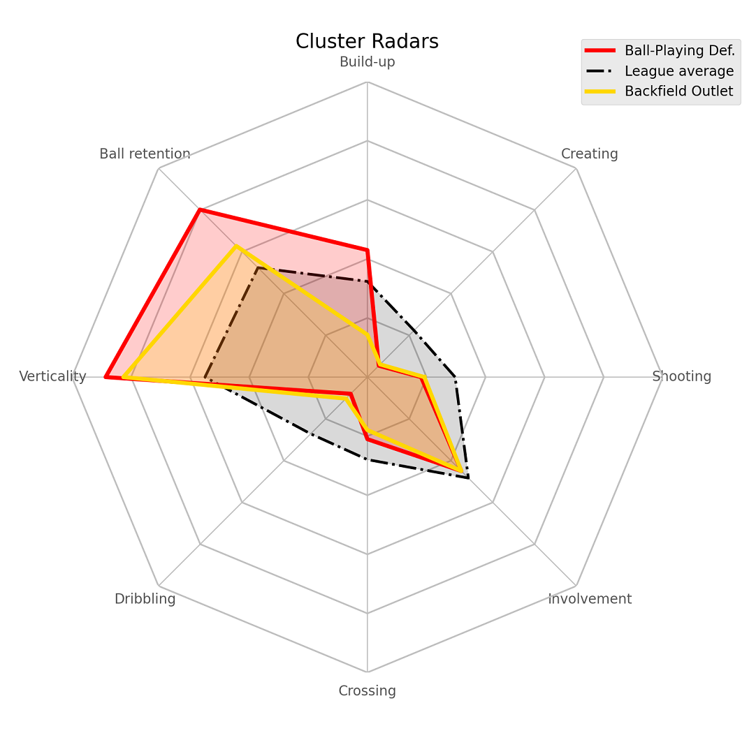
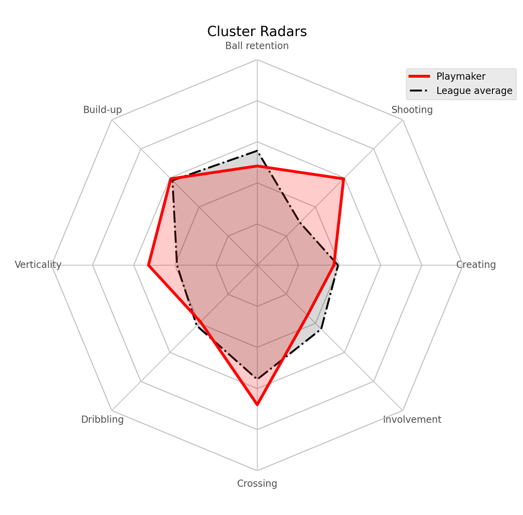
We can see how both are mostly the same in a lot of metrics like shooting, creating, dribbling but the ball-playing defenders are much more involved in build-up and retain the ball much more/better
The ramifications of these differences in context of roles is explained very well in the original. Here are the comparison radars for a few other similar clusters.
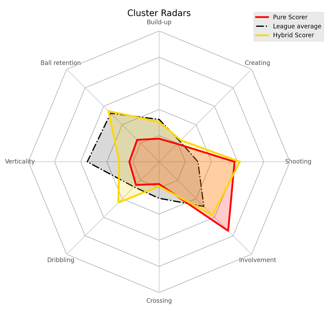 Pure Scorers vs Hybrid Scorers
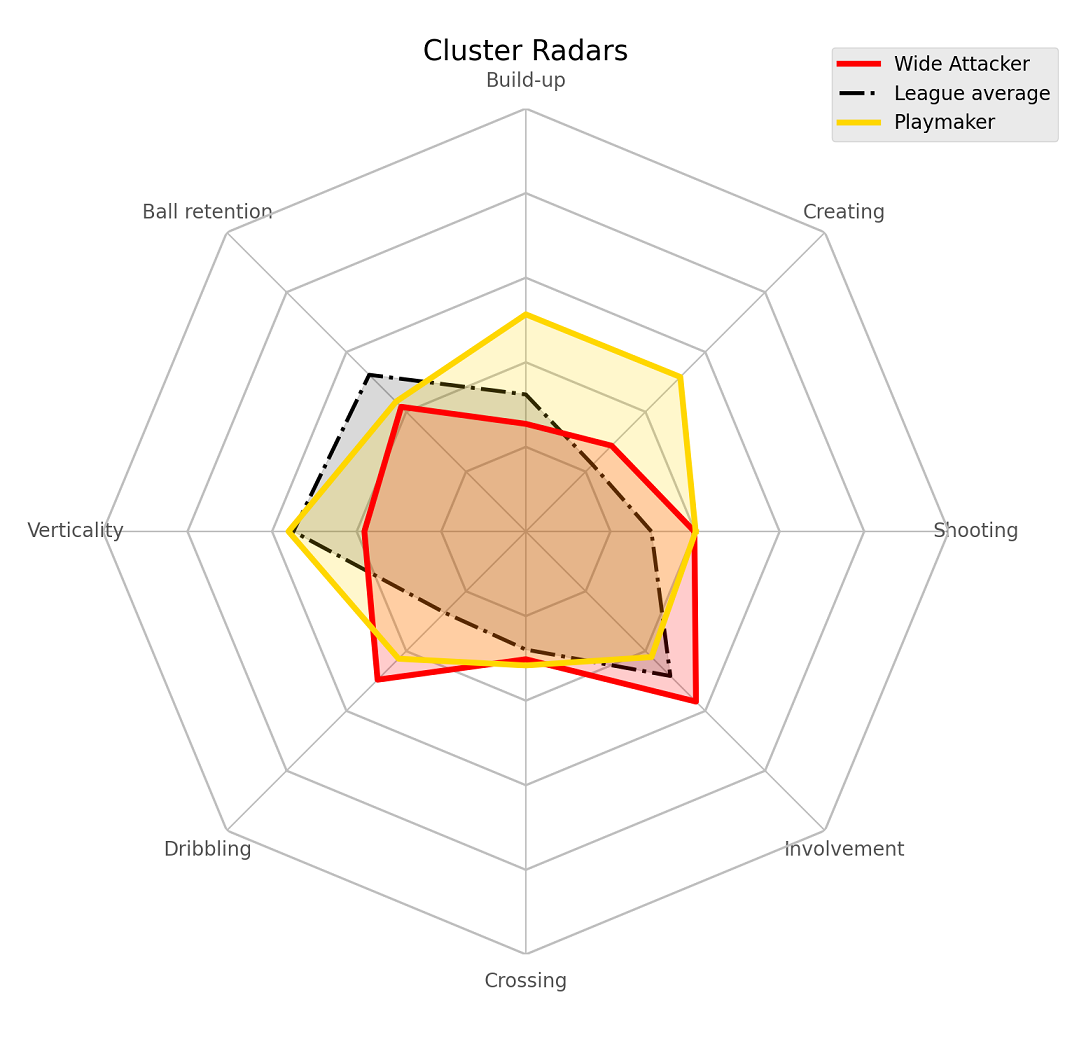 Wide Attackers vs Playmakers
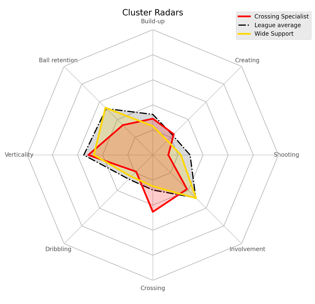 Crossing Specialist vs Wide Supporter
Limitations and Potential Improvements
Most of the model limitations are mentioned in the, you guessed it, original post. For example, we have no data on defensive activity(though we do know defensive activity is influenced heavily by opportunity). Nonetheless, adding possession-adjusted versions of tackles, interceptions, fouls and aerial duels will certainly help us distinguish players who are stylistically different.
On the topic of data and features, another issue is the absence of spatial data. That would tell us more about where on the field do players play. We could also try converting the raw number metrics into team ratios - for example, instead of looking at just number of shots by a player, look at ratio of shots taken by the player to the entire team’s.
The second most important limitation is the question about “high performance within a role vs. misclassification of the player”. For example, a fullback inverting into midfield (looking at you, Kyle Walker) and in general doing more midfielder-y stuff (being more involved in build-up, crossing less) is going to be classified as a midfielder. The best way to go about fixing this would perhaps be a more probabilistic approach to clustering, i.e., predicting that the probability of Walker being a midfielder is 0.45, full-back is 0.5 etc.
The third biggest limitation of this method is that there’s no regulation on the sizes of the clusters. This combined with the absence of a great evaluation method can (potentially) really mess up your clusters - especially if the features are not carefully chosen too (I can’t tell you the number of times I got a cluster full of only Manchester City players after I put in the wrong input). As it is, if you call np.bincount on the labels, you’ll notice that my largest cluster is twice as big as the smallest. Fixing this might also indirectly chip away at the misclassification problem; setting a lower and upper cap on cluster sizes might lead to tighter clusters.
My final idea for possible improvements is to simply try a bunch of other dimension reduction algorithms(UMAP, variational auto-encoders, or even good old PCA), or tweaking the complexity hyper-parameter, and/or increasing the number of components for t-SNE reduction). The last part I did try but the improvement wasn’t all that much but with the added downside of it being no longer easy enough to create those scatter plots so I decided to leave it out.
Hopefully, this post was helpful in some manner! I had a lot of fun working through it. Huge thanks to Michael himself for allowing me to do this plus always patiently helping me with all the questions I had. Also shout out to Sushruta and Maram for reading an earlier version of this draft. ![]()
For any kind of feedback(suggestions/questions) about this post or the code, feel free to reach out to me on Twitter or drop me a mail(the former is always faster).